

Setting up the environment
suppressMessages(library(tidyverse))
suppressMessages(library(repr))
suppressMessages(library(randomForest))
suppressMessages(library(caret))
suppressMessages(library(cowplot))
suppressMessages(library(Metrics))
suppressMessages(library(AUC))

set.seed(123)
options(repr.plot.width=7, repr.plot.height=3)
분포의 주요 특성
기댓값
평균 (or expected value) 은 어떤 확률 과정을 무한히 반복했을 때, 얻을 수 있는 값의 평균으로서 기대할 수 있는 값. 보다 엄밀하게 정의하면 기댓값은 확률 과정에서 얻을 수 있는 모든 값의 가중 평균이다.
- 이산 확률 변수의 PMF $p(x)$ 가 있을 때 기댓값 $E[X]=\sum_x xp(x)$ 이다.
- 연속 확률 변수의 PDF $f(x)$ 가 있을 때 $E[X]=\int\limits_{-\infty}^{\infty} xf(x)\,dx$.
모평균과 표본평균의 차이점은 아래 설명에서 확인해보자.
population mean : 모평균
sample mean : 표본 평균
You could hear terms like population mean and sample mean. What’s the difference? For example, you want to check duration of time from first exposure to HIV infection to AIDS diagnosis, so your population is going to be every human who had exposure to HIV. In real life it is never possible to gather information about population, but what you could is gather information about some people (sample) and then make assumptions about population based on information about the sample.

- 표본 평균 다음과 같은 식으로 정의된다. $\bar{X}=\frac{1}{n}\sum_{1}^{n}X_i$
분산 (variance)
분산 은 어떤 확률변수가 기댓값으로부터 얼마나 떨어진 곳에 분포하는지를 가늠하는 숫자이다.
- $X$ 가 이산 확률 변수 이고 pmf 가 $p(x) = P(X = x)$ 를 따른다면 :
\begin{align} Var(X)=\sum_{x}(x-\mu)^2p(x) \end{align}
$\mu$ 는 평균이다.
- $X$ 가 연속 확률 변수 이고 pdf 가 $f(x)$ 를 따른다면 : \begin{align} Var(X)=\int\limits_{-\infty}^\infty (x-\mu)^2f(x) \,dx \end{align}
- 분산 $\sigma^2$ 을 따르는 확률 변수들 $X_i$, $i\in[1;n]$ 의 표본 분산 은 다음으로 정의된다 :
\begin{align}
s^2=\frac{\sum_{i=1}^{n}(X_i-\bar{X})^2}{n-1}
\end{align}
n이 아니라 n-1로 나눈다는 것을 주의하자. 값에 큰 영향을 주지는 않지만 통계적인 관습이라고 생각하면 된다.
표준 편차 (standard deviation)
표준 편차 은 분산의 제곱근으로 정의되고 평균으로부터 데이터 포인트의 변화에 대해서 알려준다. 표준 편차가 작을수록 평균값에서 변량들의 거리가 가깝다. 표준 편차는 데이터 분포와 같은 단위를 가지고 있기 때문에 분산보다 해석하기가 용이하다. \begin{align} sd(X)=\sqrt{Var(X)} \end{align}
표본 표준 편차: $s=\sqrt{s^2}$
중앙값 (median)
중앙값 은 정렬했을 때 가장 중앙에 위치하는 값을 의미한다.
For example we have dataset {1, 4, 5, 6, 1, 1, 5, 7, 120}. First we have to sort it ad then find the middle value {1, 1, 1, 4, 5, 5, 6, 7, 120}. So the median is 5.
왜 평균보다 중앙값을 사용하는 것이 더 나을때가 있을까? 평균값은 이상값 (outlier) 에 취약하다. 예를들면 데이터셋 {1, 4, 5, 6, 1, 1, 5, 7, 120} 의 평균은 16.67 이다. 대다수 데이터들의 값은 평균값보다 많이 작음에도 불구하고 120짜리 데이터 때문에 평균값이 크게 증가하였다. 이런 경우에는 평균값보다 중앙값을 사용하는 것이 데이터 해석에 더 용이할 것이다.
공분산 및 상관 (Covariance and Correlation)
공분산 은 2개의 확률 변수의 상관정도를 나타내는 값이다. 확률 변수 X의 증감에 따른 확률 변수 Y의 증감의 경향에 대한 측도이다. \begin{align} Cov(X_1,X_2)=E(X_1 X_2) - E(X_1)E(X_2) \end{align} 표본 공분산 (estimator of the true covariance): \begin{align} \hat{Cov}(X_1, X_2) = \frac{1}{n}\sum_{i}^{n}(X_{1i} - \bar{X_1})(X_{2i} - \bar{X_2}) \end{align}
공분산은 해석하기가 어렵다. 예를 들면, $Cov(X,Y)=200$ 은 두 변수 X와 Y 사이의 관계가 있다는 것을 말해주지만 어느정도의 강한 관계가 있는지는 말해주지 않는다. 이럴 경우에 상관(Correlation) 이 효율적이다.
상관의 정의를 보자. \begin{align} Cor(X_1, X_2) = \frac{\hat{Cov}(X_1, X_2)}{\sqrt{Var(X_1)Var(X_2)}} = \frac{\hat{Cov}(X_1, X_2)}{sd(X_1)sd(X_2)} \end{align}
\begin{align}
-1 \leqslant Cor(X_1, X_2) \leqslant 1
\end{align}
- $Cor(X_1, X_2)=0$ - $X_1$ 과 $X_2$ 는 상관 관계가 없다.
- $Cor(X_1, X_2)=1$ - $X_1$ 과 $X_2$ 사이에 강한 양의 상관 관계가 있다. $X_1$ 이 감소할 때 $X_2$ 도 감소 한다.
- $Cor(X_1, X_2)=-1$ - $X_1$ and $X_2$ 사이에 강한 음의 상관 관계가 있다. $X_1$ 이 증가할 때 $X_2$ 는 감소 한다.
예제를 살펴보자.
The duration of time from first exposure to HIV infection to AIDS diagnosis is called the incubation period. The incubation periods of a random sample of 14 HIV infected individuals is given (in years).
- 표본 평균, 표본 중앙값, 표본 표준 편차를 계산해보자.
inc_period <- c(12.0, 10.5, 5.2, 9.5, 6.3, 13.1, 13.5, 12.5, 10.7, 7.2, 14.9, 6.5, 8.1, 7.9)

print(paste0("Sample mean: ", round(mean(inc_period), 3)))
print(paste0("Sample median: ", median(inc_period)))
print(paste0("Sample standard deviation: ", round(sd(inc_period), 3)))
결과값을 뭐라고 해석할 수 있을까?
표본의 평균 잠복기는 10 년이고 평균 기간은 그 평균으로부터 평균 3년차이가 난다.
Serum cholesterol (mmol/L) measured on a sample of 86 stroke patients (data of Markus et al., 1995). Calculate the distribution characteristics and plot the distribution.
cholesterol <- c(3.7,4.8,5.4,5.6,6.1,6.4,7.0,7.6,8.7,3.8,4.9,5.4,5.6,6.1,6.5,7.0,7.6,8.9,3.8,4.9,5.5,5.7,6.1,
                 6.5,7.1,7.6,9.3,4.4,4.9,5.5,5.7,6.2,6.6,7.1,7.7,9.5,4.5,5.0,5.5,5.7,6.3,6.7,7.2,7.8,10.2,4.5,
                 5.1,5.6,5.8,6.3,6.7,7.3,7.8,10.4,4.5,5.1,5.6,5.8,6.4,6.8,7.4,7.8,4.7,5.2,5.6,5.9,6.4,6.8,7.4,
                 8.2,4.7,5.3,5.6,6.0,6.4,7.0,7.5,8.3,4.8,5.3,5.6,6.1,6.4,7.0,7.5,8.6)

print(paste0("Sample mean: ", round(mean(cholesterol), 3)))
print(paste0("Sample median: ", median(cholesterol)))
print(paste0("Sample variance: ", round(var(cholesterol), 3)))
print(paste0("Sample standard deviation: ", round(sd(cholesterol), 3)))
표본에서 평균 세럼 콜레스테롤 레벨은 6.3 이고 레벨들은 평균으로부터 평균 1.4년 차이가 난다.
이제 시각화를 해보자
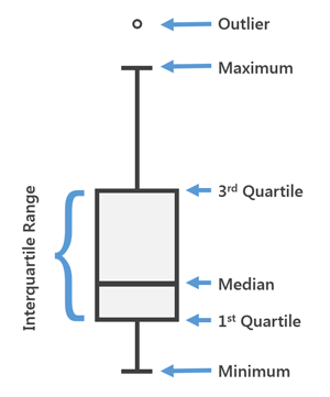
Histogram vs Boxplot
- Histogram : 데이터 그룹의 빈도를 보여주며 데이터 셋의 가장 빈번한 값이 어디인지를 알 수 있다. 데이터가 어느쪽으로 기울어져 있는지도 확인할 수 있다.

- Boxplot : 데이터의 .25, .5, .75 분위수, 최소값 및 최대 값을 보여 주며, 특이점 검출에 편리하다.
df <- data.frame(cholesterol)
ggplot(df, aes(x = cholesterol)) +
    geom_histogram(bins = 20, fill="green", alpha=0.3) +
    geom_vline(aes(xintercept=mean(cholesterol)), ## straight line for the mean
               colour = "red", size=0.5) +
    geom_vline(aes(xintercept=median(cholesterol)), ## dashed line for the median
               colour = "red", linetype="dashed", size=0.5)

ggplot(df, aes(x = "", y = cholesterol)) + geom_boxplot(fill = "green", alpha = 0.3) +
    stat_summary(fun.y=mean, colour="darkred", geom="point", size=2) #red dot for the mean
 *
**The data below show the consumption of alcohol (X, liters per year per person, 14 years or older) and
the death rate from cirrhosis, a liver disease (Y, death per 100,000 population) in 15 countries (each
country is an observation unit).
*
**The data below show the consumption of alcohol (X, liters per year per person, 14 years or older) and
the death rate from cirrhosis, a liver disease (Y, death per 100,000 population) in 15 countries (each
country is an observation unit).
- 관계를 알아보기 위해 다이어그램을 그려라. 만약 두 변수 사이에 어떠한 관계가 존재한다면, 어떠한 계산없이 관계 결과를 도출할 수 있는가?
- 상관 계수와 공분산을 계산하라.
X <- c(24.7, 15.2, 12.3, 10.9, 10.8, 9.9, 8.3, 7.2, 6.6, 5.8, 5.7, 5.6, 4.2, 3.9, 3.1)
Y <- c(46.1, 23.6, 23.7, 7, 12.3, 14.2, 7.4, 3.0, 7.2, 10.6, 3.7, 3.4, 4.3, 3.6, 5.4)

df <- data.frame(X, Y)

## Good way to visualize the connection is to draw a scatter plot
ggplot(df, aes(x=X, y=Y)) +
    geom_point() +
    geom_smooth(method=lm, se=FALSE) +
    labs(x = "Alcohol consumption",
         y = "Death Rate from Cirrhosis",
         title = "Relation between two variables")

그래프를 보면 강한 양의 상관 관계가 있는것 처럼 보인다. 알코올 소비가 증가하면 간경화로 인한 사망률 또한 증가한다고 볼 수 있다. 우리의 결론이 옳은지 상관 계수를 계산하여 확인해보자.
print(paste0("Covariance between Alcohol consumption and Death Rate from Cirrhosis: ", round(cov(X, Y), 2)))
print(paste0("Correlation between Alcohol consumption and Death Rate from Cirrhosis: ", round(cor(X, Y), 2)))
위의 코드를 실행하면 상관값이 0.94가 나오는 것을 확인할 수 있고 따라서 알코올 소비와 간경화로 인한 사망률이 어떤 관계를 가지고 있는지 확인할 수 있다.
This post has been released under the Apache 2.0 open source license.